


The challenge
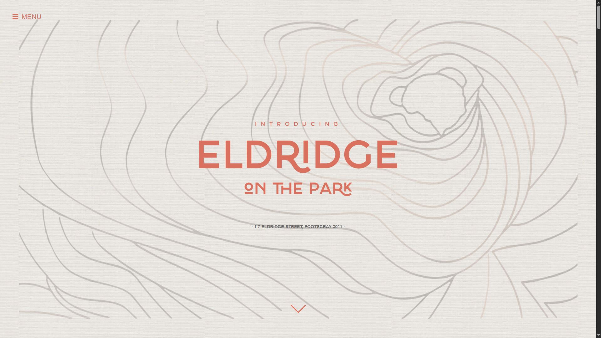
The project started from a brochure prepared for print, not from a web-native design system. The task was to translate that visual language into a responsive website without losing the tone, atmosphere, and sales presentation of the original material.
What I did
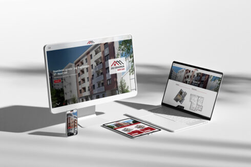
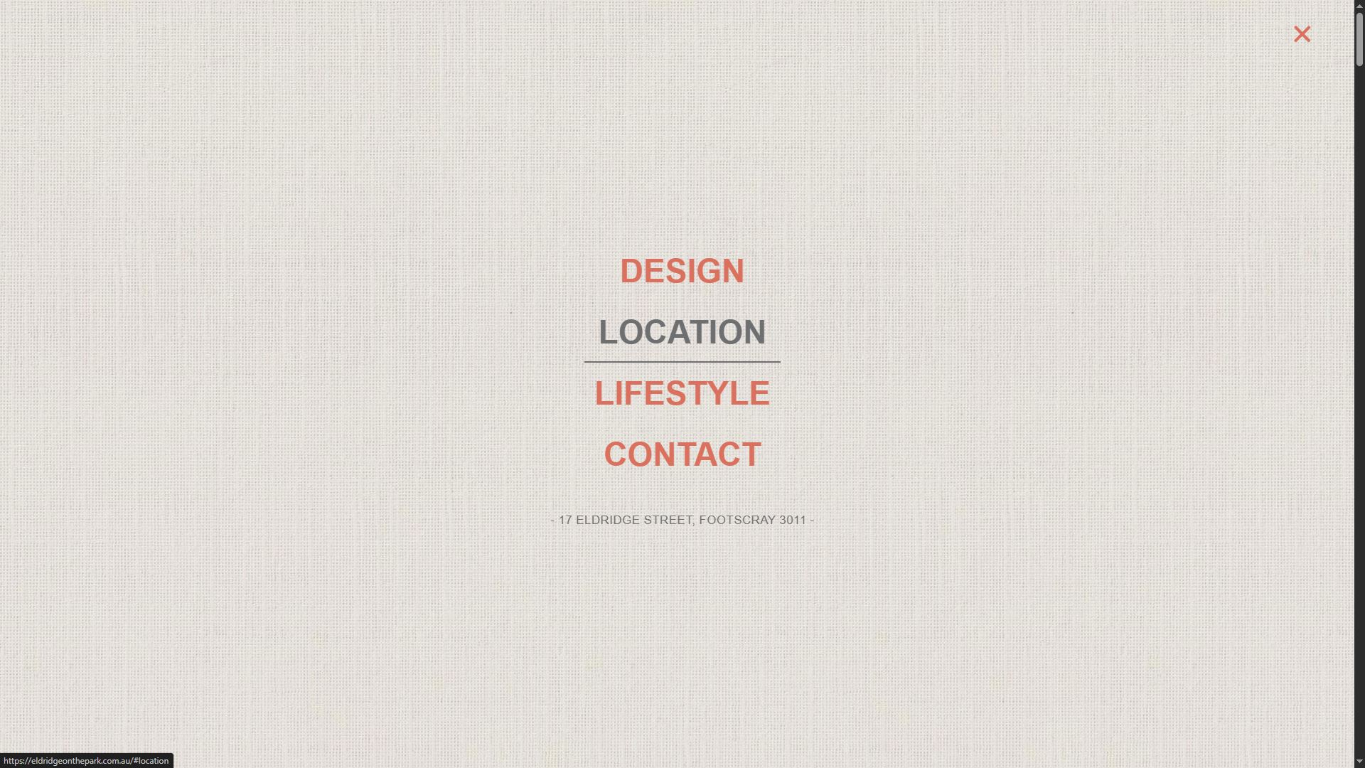
I installed a clean WordPress setup with the Hello theme and developed the website from scratch in Elementor directly on the development server. The build focused on preserving the brochure’s visual character while reorganizing it into a web structure that could adapt cleanly across desktop, tablet, and mobile.
Key build details
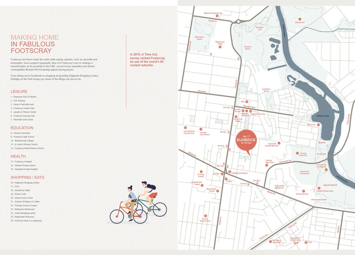
The site was developed as a polished presentation website for a limited residential release of 14 three-level townhouses. It included a custom homepage structure, responsive section-based layouts, popup-based navigation and registration flows, embedded media, and location-focused content presentation.
Outcome
The result was a responsive property website that carried the feel of the original brochure into a usable digital format, giving the client a strong project presentation without drifting into a generic template look.