


The challenge
This project was not about inventing a new visual direction from scratch. The client already had a polished PDF brochure that defined the look, tone, and overall presentation of the development.
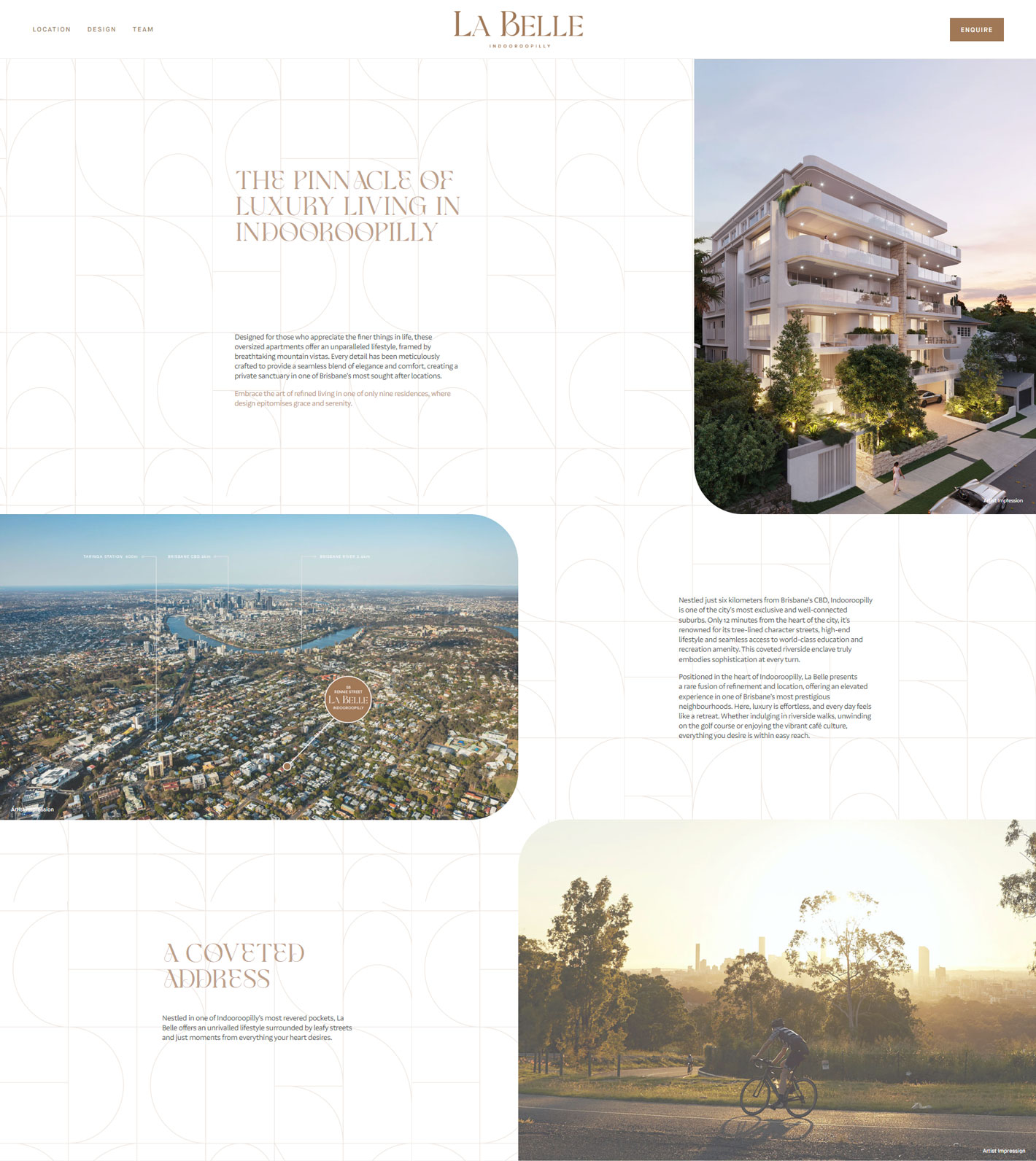
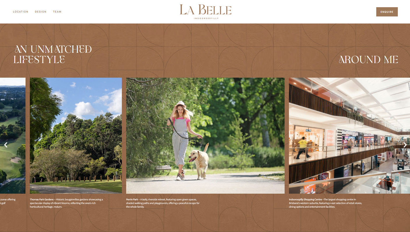
The real challenge was turning that static brochure into a working website that still felt refined on screen. It needed to carry the same premium atmosphere, support enquiry-driven browsing, and present the project in a way that felt clear and composed across desktop and mobile.
What needed to work
The website had to do more than simply mirror the brochure. It needed to translate print-based layouts into a responsive structure, preserve the project’s upscale presentation, and guide visitors naturally through the key parts of the story.
That meant building a front-end experience that could support strong imagery, controlled typography, content hierarchy, and marketing sections such as location, design, team, and enquiry without feeling heavy or fragmented.
My approach
My role here was to take the client’s supplied brochure direction and develop it into a live website.
That meant interpreting the visual system of the brochure and rebuilding it for the web in a way that remained faithful to the original presentation while also working as a proper digital experience. The focus was on layout translation, responsive behavior, spacing, content flow, and the small front-end decisions that make a site feel calm rather than clumsy.
Instead of overcomplicating it, the goal was to let the content, imagery, and presentation carry the project. The website needed to feel premium and deliberate, while staying easy to navigate and straightforward to use.
Build details
The work centered on front-end implementation and visual fidelity.
Key attention points included:
- translating brochure-based composition into responsive page layouts
- preserving the tone of a high-end property presentation
- creating clean section flow for marketing content
- supporting enquiry calls to action without making the experience feel pushy
- making sure the site remained polished across screen sizes
This was the kind of project where restraint mattered. The value was not in adding more features, but in building the website carefully enough that the final result felt smooth, balanced, and trustworthy.
Outcome
The final site gave the project a strong digital presence while staying aligned with the client’s original brochure direction.
Instead of feeling like a disconnected adaptation, the website carried the same premium visual language into a responsive format that was easier to browse, easier to update, and better suited for live marketing. It became a clean web extension of the original sales material rather than a separate visual story.